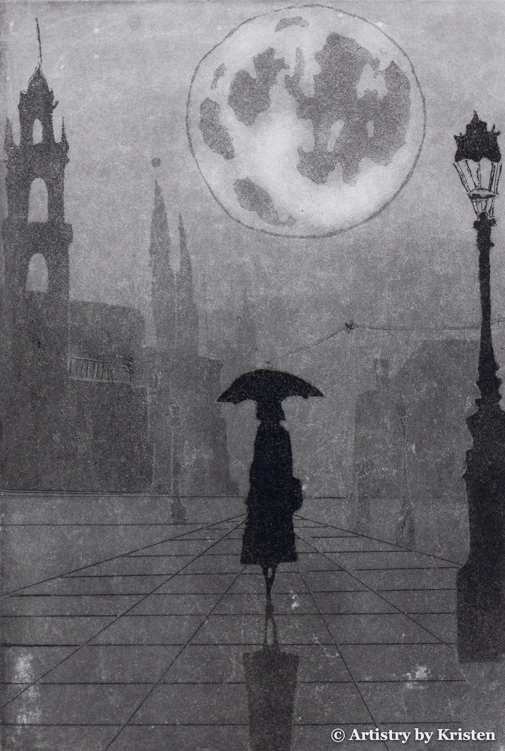
Artistry by Kristen
Nostalgia and Belonging in Printed Form
Kristen is a printmaker whose etchings depict light and shadows in an effort to understand what home, belonging, and displacement mean to her. These concepts reveal themselves in her prints through the literal and metaphorical distance between objects as she paints with acid. Based between Italy and America, Kristen travels around the world trying to understand the similarities and differences in humans in comparison to herself. Her prints are a vessel to keep the people, the memories, and the emotions alive. Kristen has exhibited prints internationally including several solo exhibits in England, Italy, and America. She has received awards from Ironbridge Printmaking and Teravarna. Her prints are held in many private and public collections.
A glimpse of the different types of prints available …
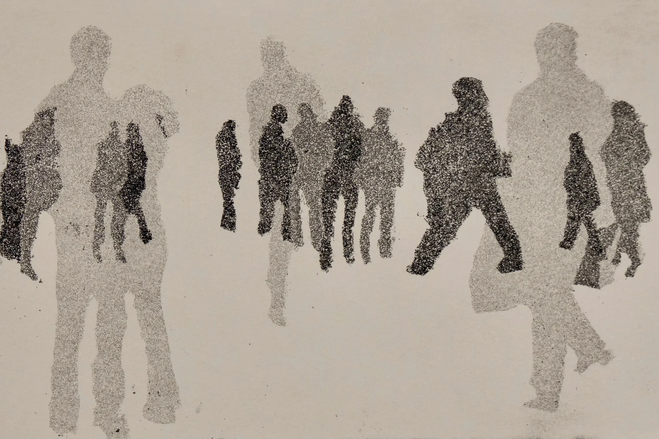
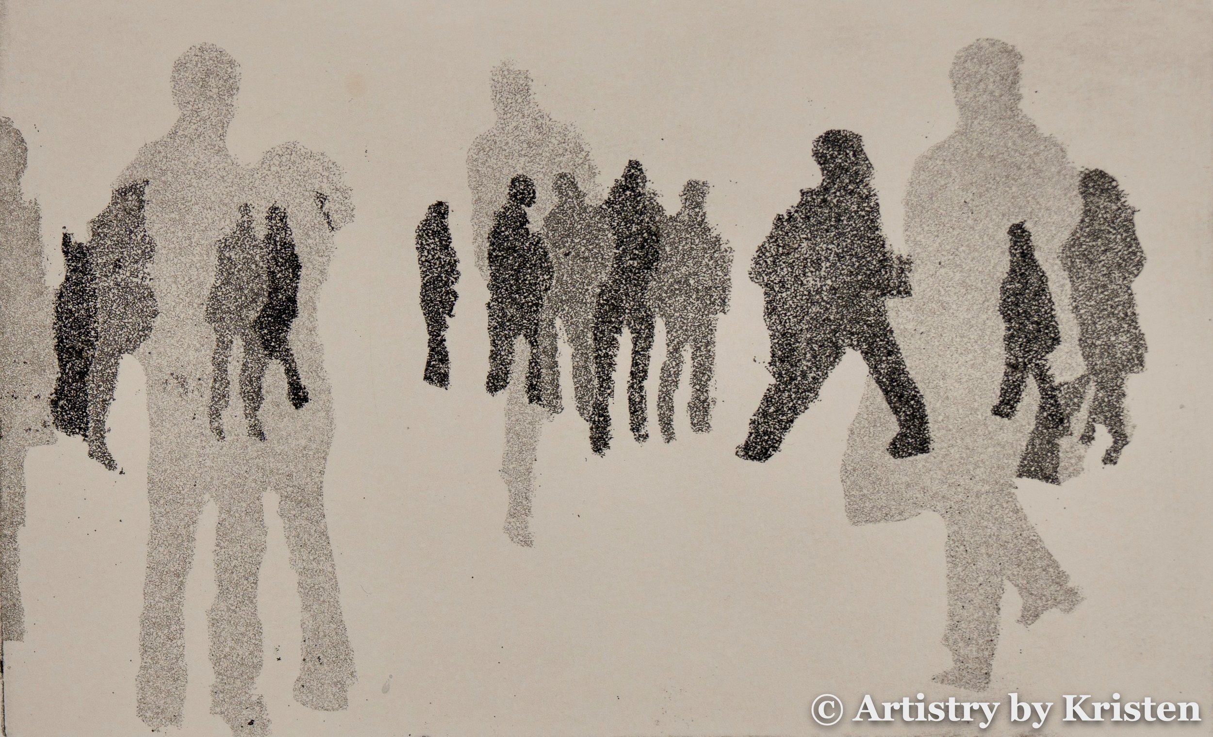
Alone with Others, 12 x 20 cm, Aquatint Etching $150
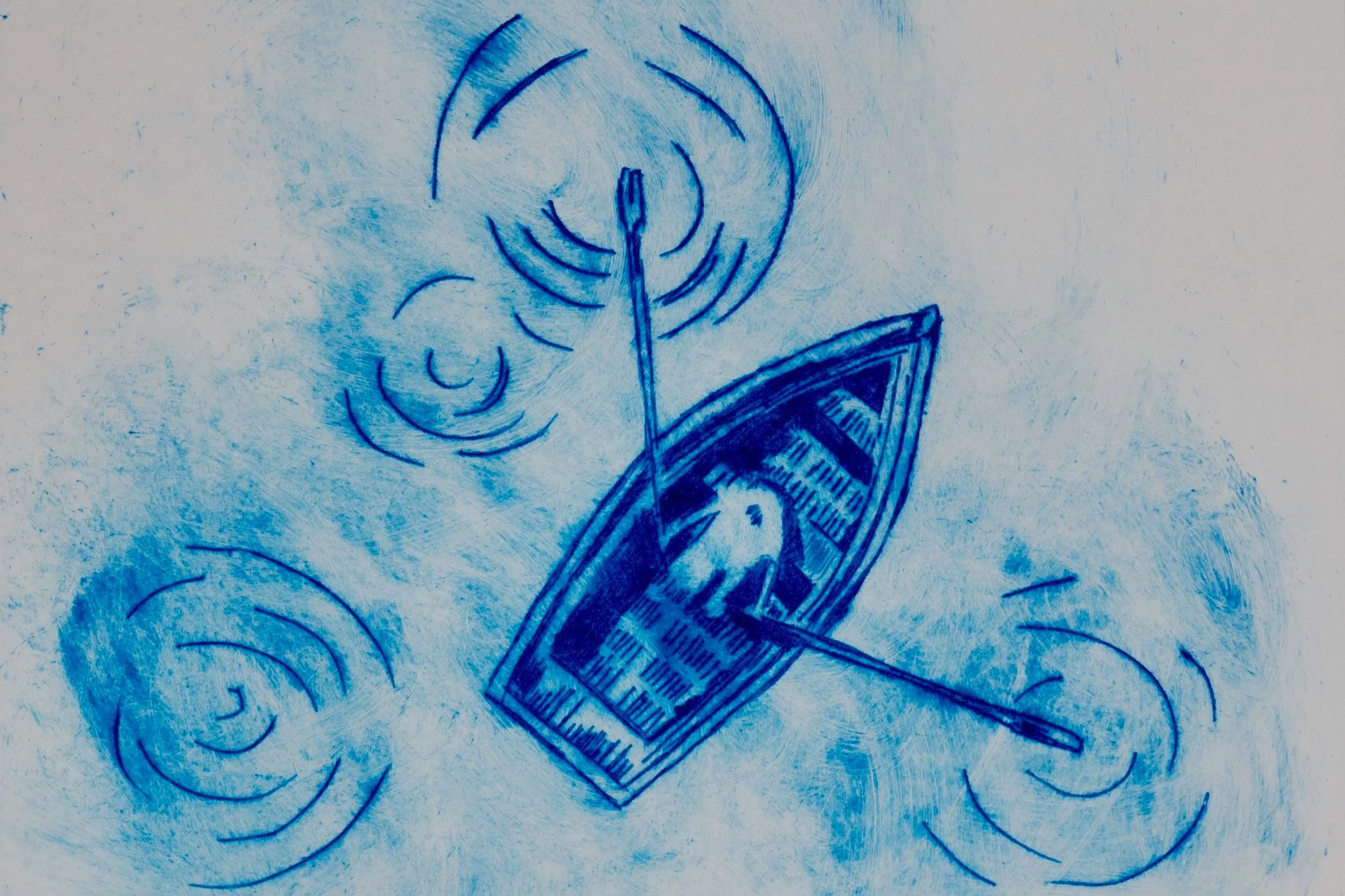
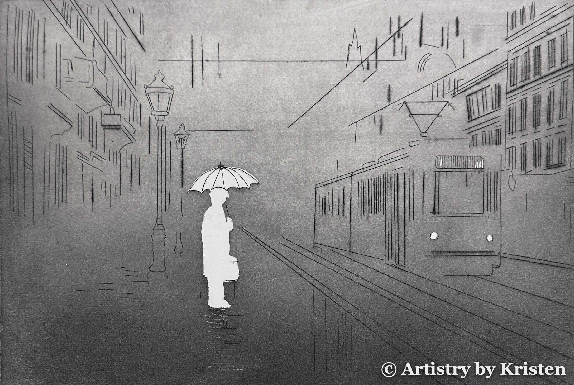
Quiet Seclusion, 28 x 21 cm, Drypoint $300
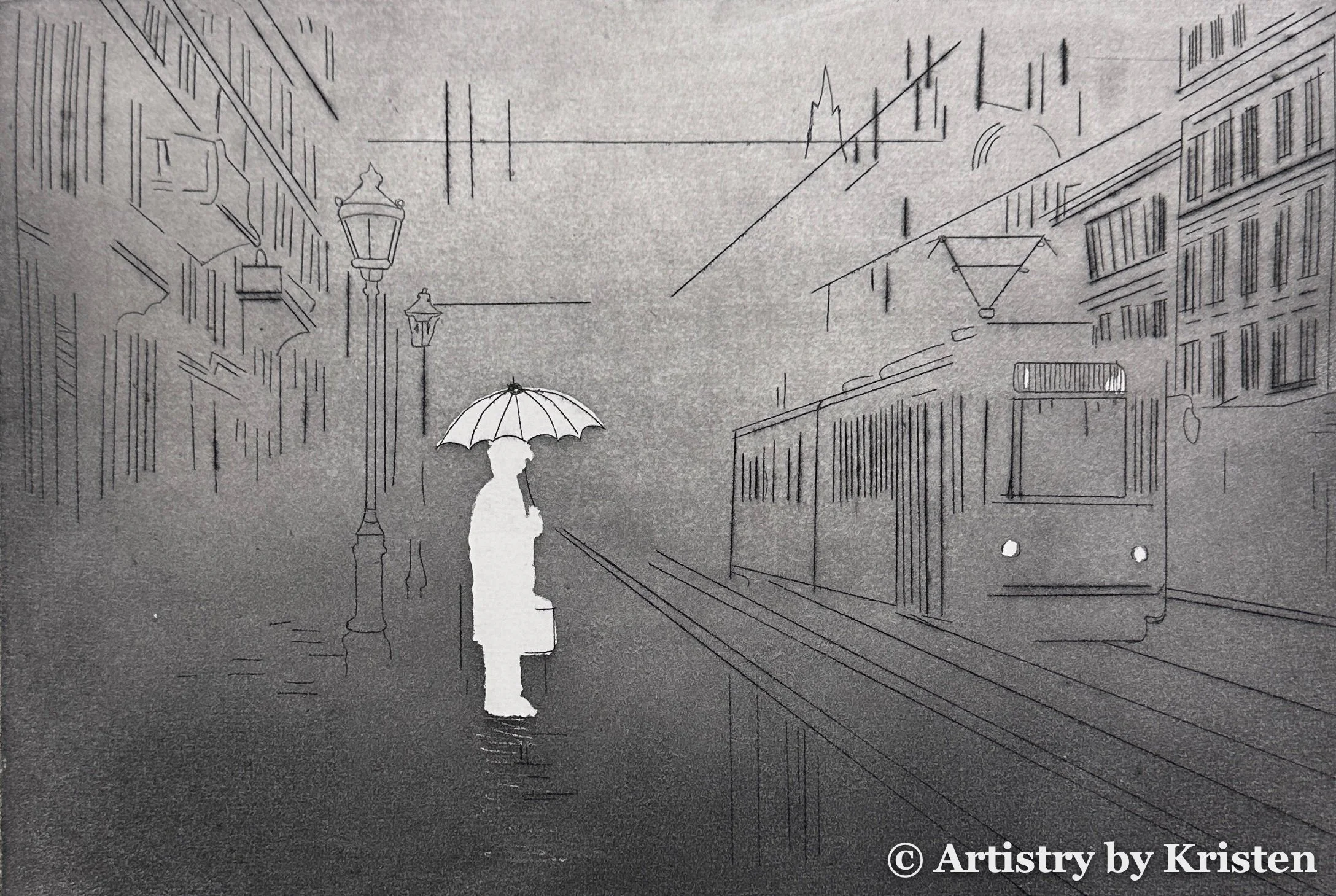
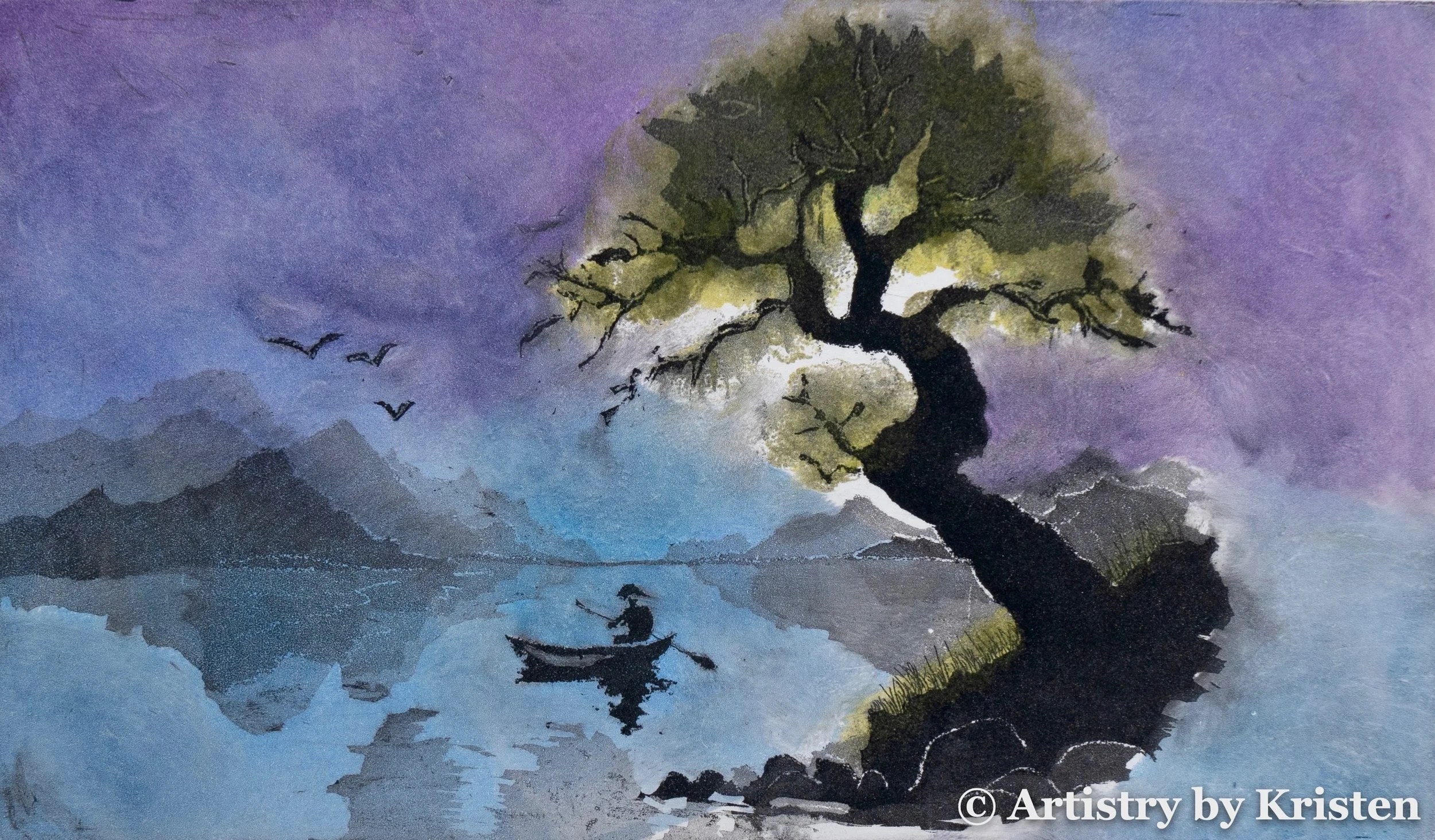
Somewhere I Almost Stayed, 20 x 30 cm, Aquatint Etching $200
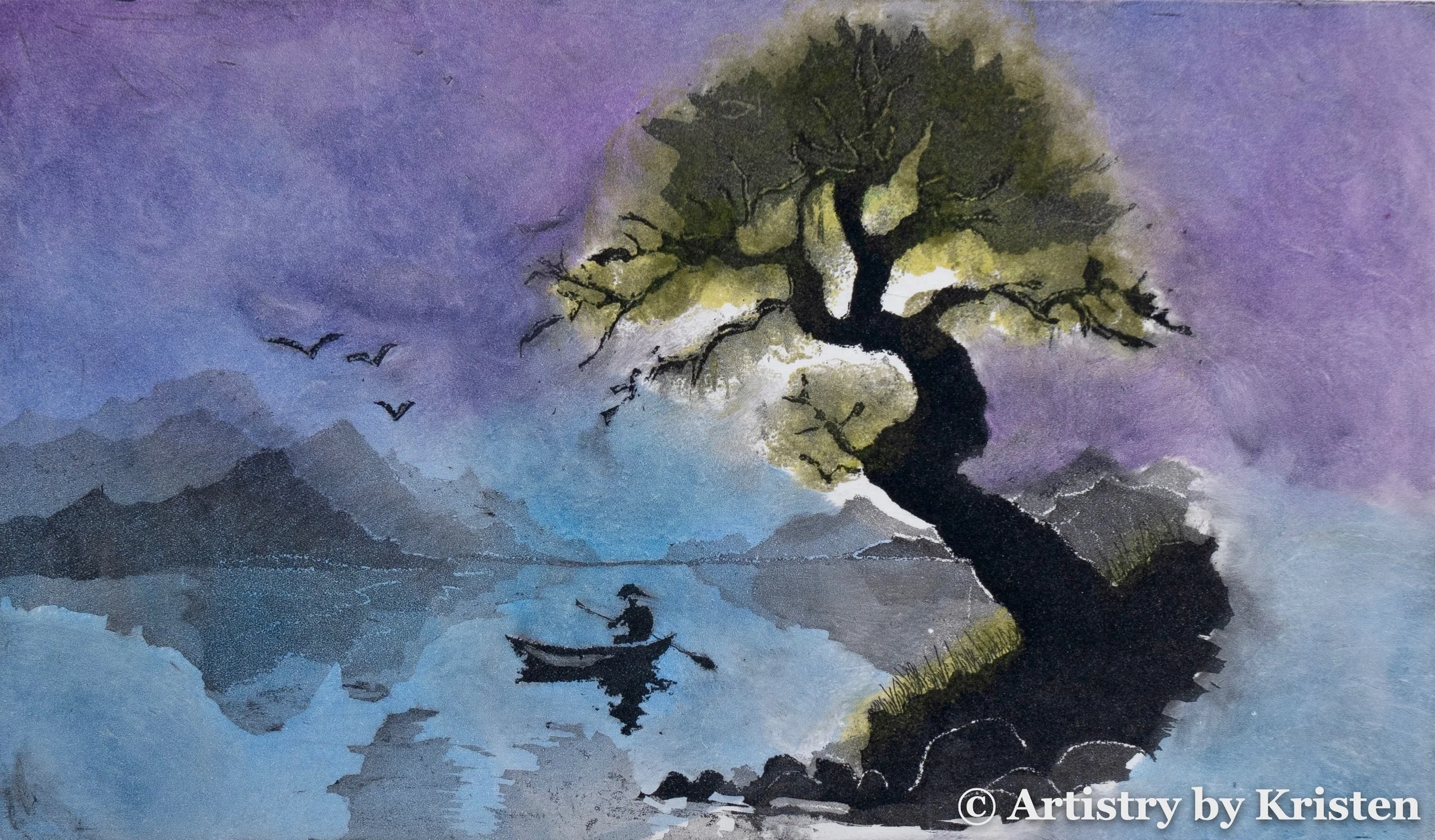
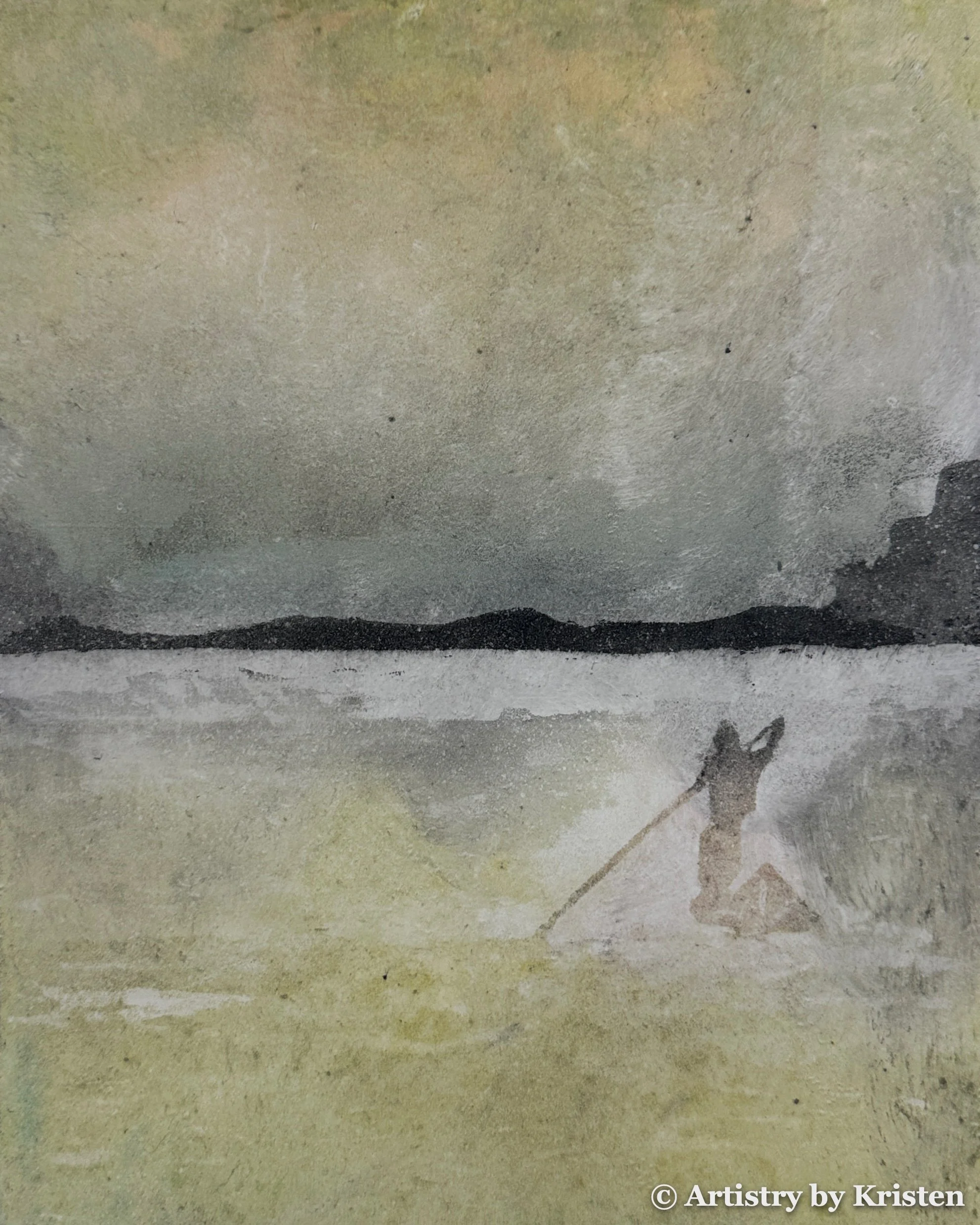
Between the Shore and Sky, 20 x 30 cm, Aquatint Etching $300
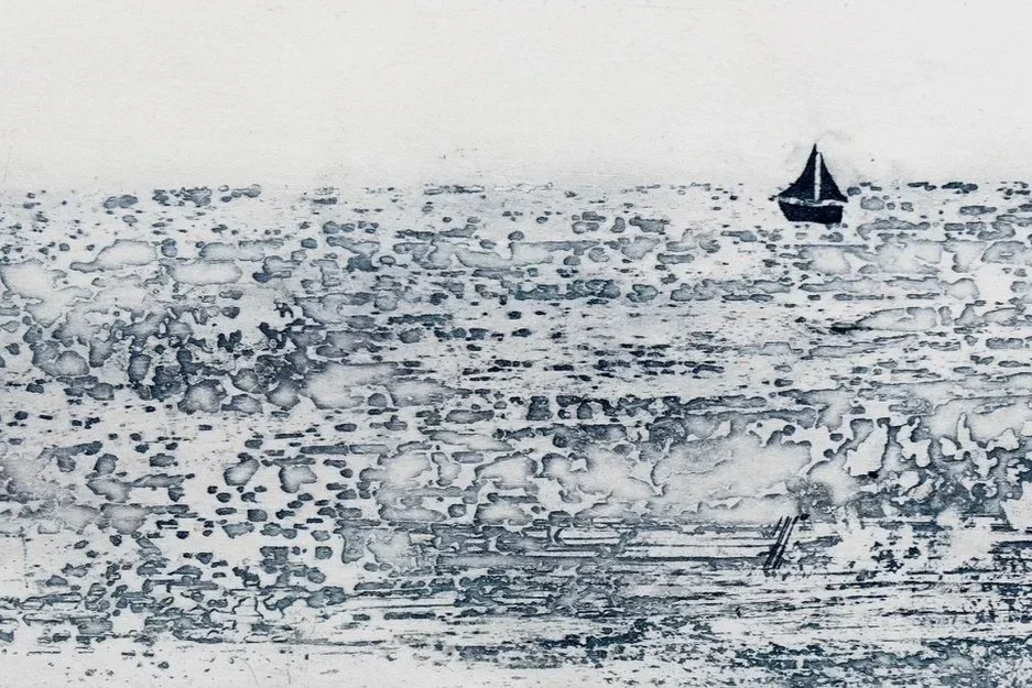
Patchwork Sea, 10 x 20 cm, Etching and Coffee Lift $200
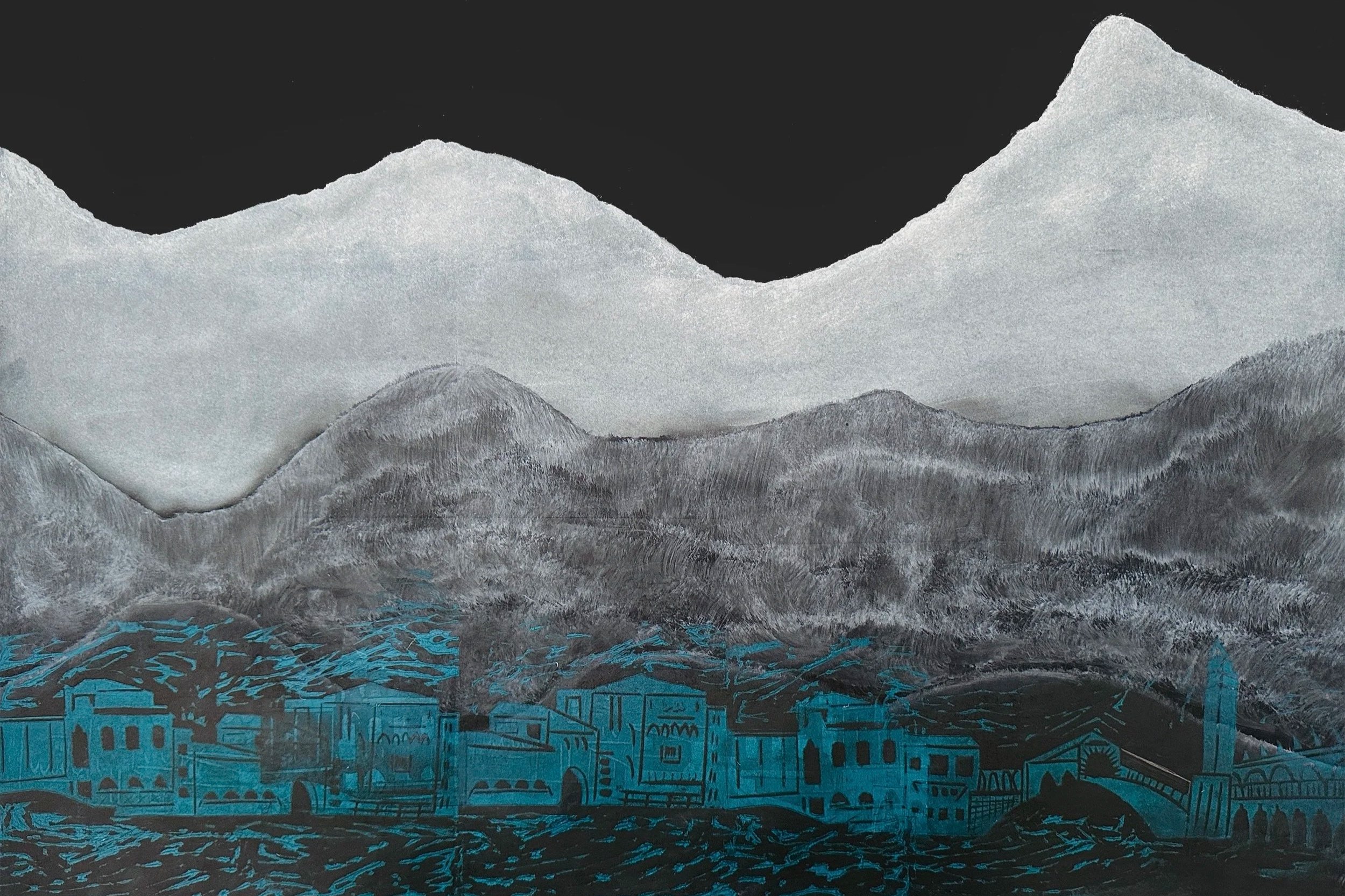
Contradiction: Venezia, 40 × 60 cm, Charcoal and Linocut $450
Discover the Collections
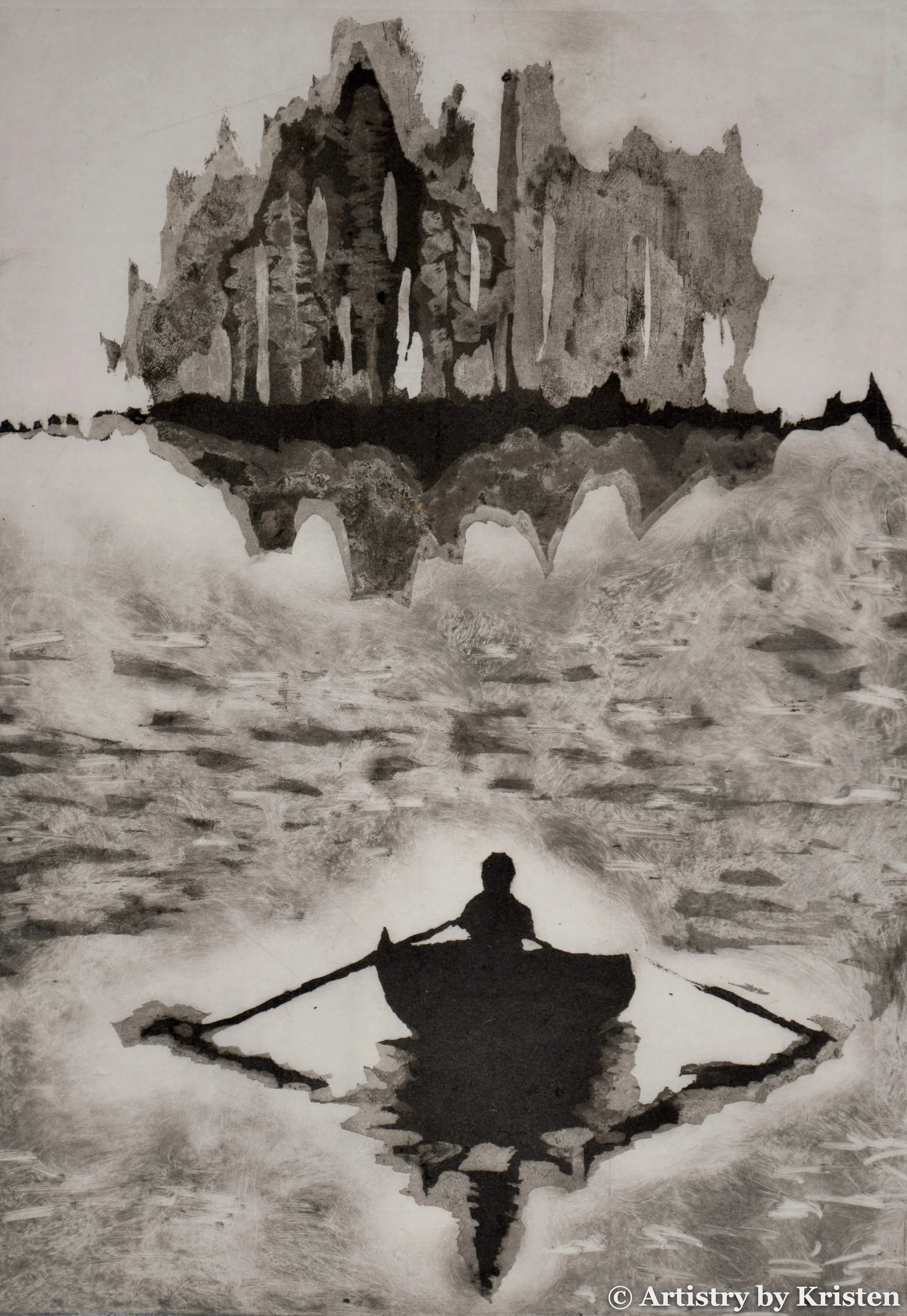
The Reminiscence collection of prints depict home and belonging as shifting feelings rather than fixed points. Each piece is an intersection between what is present and what is absent on the plate, both physically and metaphorically. The forms give way to feelings as both movement and stillness are captured in each image.
No one can truly belong everywhere. At some level, everyone has experienced both belonging and displacement. Each print becomes a vessel to figure out what belonging means which is represented by moving horizons, crowds forming and dissolving, and reflections blurring into memory.
The latin word for reminiscence is reminisci, meaning “to look back”. It suggests both warmth and distance, like remembering something that is fading. The misty light and the shifting water/sky further emphasize an environment receding from memory. This begs the question: do we feel belonging most often in hindsight, when we reminisce?
Reminiscence
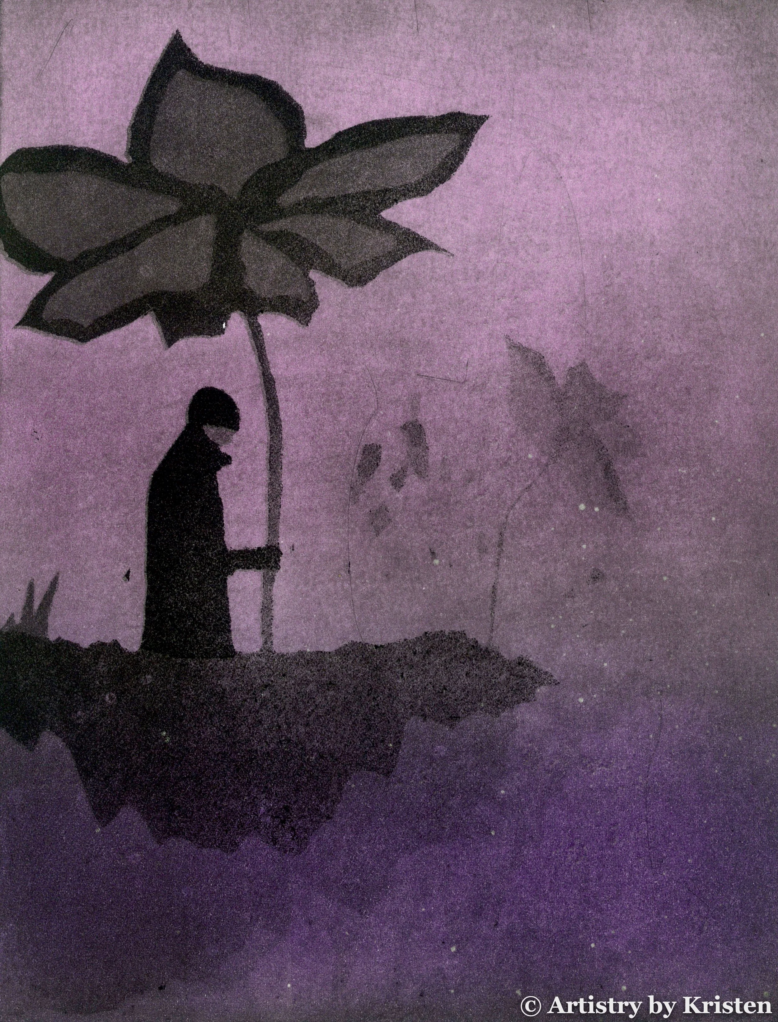
The color collection explore the tension between vibrant colors and the colorless human silhouette. Rich hues inspired by the natural world surround the silhouette. Color often serves as a cultural language communicating values, emotions, spirituality, belonging, and memory. When people experience displacement, they may cling more tightly to their culture in an act of remembrance or distance themselves from it because of the pain associated with leaving. In this collection, color serves as an anchor tethering the colorless human silhouette to places, memories, and emotions.
Each hue is connected to a particular emotional landscape: the soft pink of nostalgia, the aggressive pull of dark red, the misty uncertainty of light green, and the stormy ache of deep blue. Including color in each piece proved to be intense and complex. Both the beauty and the tension exists at the same time and is in conversation with each other.
To exhale color. To release it. To let it exist on its own terms.